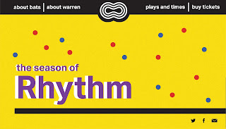
We quickly developed some home page concepts for our website on Illustrator, based on our first posters that were being designed at the same time. We wanted to incorporate our logo, and the white circle and black lines that were a big part of the animation. The colourful circles were also part of the animation, and at the same time as playing around with these website concepts, we were playing around with using them in our posters.
We decided to go with a much more simple, clean approach for our poster and website. The below are quick mockups in Illustrator again, and from here we were able to make the webside quickly in XD.
Clickable XD version, further cleaned up:
After the interim, we decided to change the visual style quite a lot. From here, we'll change the homepage to have four different pages that can be clicked through - one for Rhythm, and one for each season. We'll also incorporate our colourful lines from the posters onto the website.
Development from posters
By incorporating the full shape of the lines that were used on the poster, a cohesive base made it a lot easier to design the whole website. The lines create consistency throughout the website, while still allowing for freedom and detail due to their simplicity. While purple and yellow are still the main colours used for text and background, it is clear that blue and red are a key part of the colour palette.
We decided to use a burger menu to allow the base of the website to be simple, and let the imagery shine through and communicate our season.
We struggled with the burger menu at the start of designing this website but opted for a simple and clean approach to reflect the visual style we had already developed.
After getting a few people to test the website, we realised the concept was unnecessarily complicated - there were lots of buttons to click in order to get to the buy tickets page (which still needs to be made). We decided to simplify what we already had and let the colours and lines shine through and let the season speak for itself.


No comments:
Post a Comment