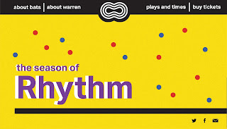
The below are quick Indesign concepts to figure out which direction to go with for the poster - experimenting with the rounded shapes from the animation, our logo, the lines from the animation, and a big purple/white title. None of these were really working due to the imagery and typeface - we realised afterwards that our typeface wasn't reflecting our season, and needed to be much more interesting, and maybe reflect movement.
After showing the last poster at our second interim, we sketched out the below concepts for our new poster, and found the typeface Paralucent on Adobe fonts. By duplicating the typeface three times, we created a logo that almost looks like it's moving, if you see it from a distance.
Some quick thumbnails to get some more ideas for the poster evoking more movement.
We then started developing new poster concepts with really roughly drawn lines, just to see how it would look. Instead of using all the colours from the animation, we decided to stick with two colours in order to not overwhelm the design. We also considered having other shapes in the background, but decided this wasn't adding anything positive to the design and moved on.


We then decided to make three simple posters - one for each song, to let the idea of movement shine through, and let our logo/type approach stand out. By doing this, we could use all our colours, just not spread altogether. We struggled with finding a typeface for each of the titles. The first poster here with 'littl tillt' was a rough concept of how this typeface would look on our posters, which Ella started to make out of shapes (hence why we only had a few letters). Once we saw this wasn't working, we ended up using the same typeface as the logo, paralucent - just in a different thickness.These new concepts were roughly developed as seen below:
We decided to go with the concept that had white at the bottom, as the coloured background drew the eye more and looked more interesting. Now that we had the concept sorted, we moved on to cleaning up the lines and having a different design for each, before making the posters properly in Indesign.
The above is our shape drawn for all three posters - by using different parts of the same shape in each poster, we realised that each poster can flow into each other which is successful in communicating our concept of movement, rhythm, and the circle of life.
We tiled these posters before class, and cleaned up the rules and type. Originally, we had some inconsistency because some text was capitalised at the beginning and some text wasn't. Despite the logo/title being in lowercase, we decided to make the rest of our text have a capital letter at the beginning which looked much cleaner. Once these fixes were made, we tiled them again and put them on the wall.


In class, we asked about the white at the bottom, as we weren't sure if this should also be yellow. We received feedback that while it isn't particularly unsuccessful as it draws the eye, if these posters were on a poster wall the white may look disconnected from the rest of the poster. Jason also made a good point that the text above each play title made it confusing to read, as your eye jumps around the poster. If we had space around the poster titles and put the important information together at the bottom, the posters would make much more sense to read. The negative space would also give the poster necessary breathing space.
We made some adjustments, including changing the BATS logo a little so that although the outside is still a stroke to match our poster, the inside BATS text is filled. This looks a lot cleaner but doesn't stand out too much against our Rhythm poster.
As Ella had used RGB colours for the animation, we realised these were printing weirdly and changed them to CMYK. The colours then weren't printing as accurately as we wanted, but were definitely a little better.
While designing these, we had the idea of making a 4th, stand-alone poster for just Rhythm (with no play title). This would be done using all three colours - potentially in a gradient. However, we ran out of time to develop this as much as we would have liked too and quickly made this poster. As the gradient looked great in the printing and we already had the poster, we decided to hand it in and play around with adding it into the animation. At this stage, the animation and our posters are quite different, but still relate in terms of our season and movement - each is just a different interpretation of Rhythm. If we keep the animation the same, we can still tie them together through our development of the website.


